Restwel Responsive Banner
Purpose
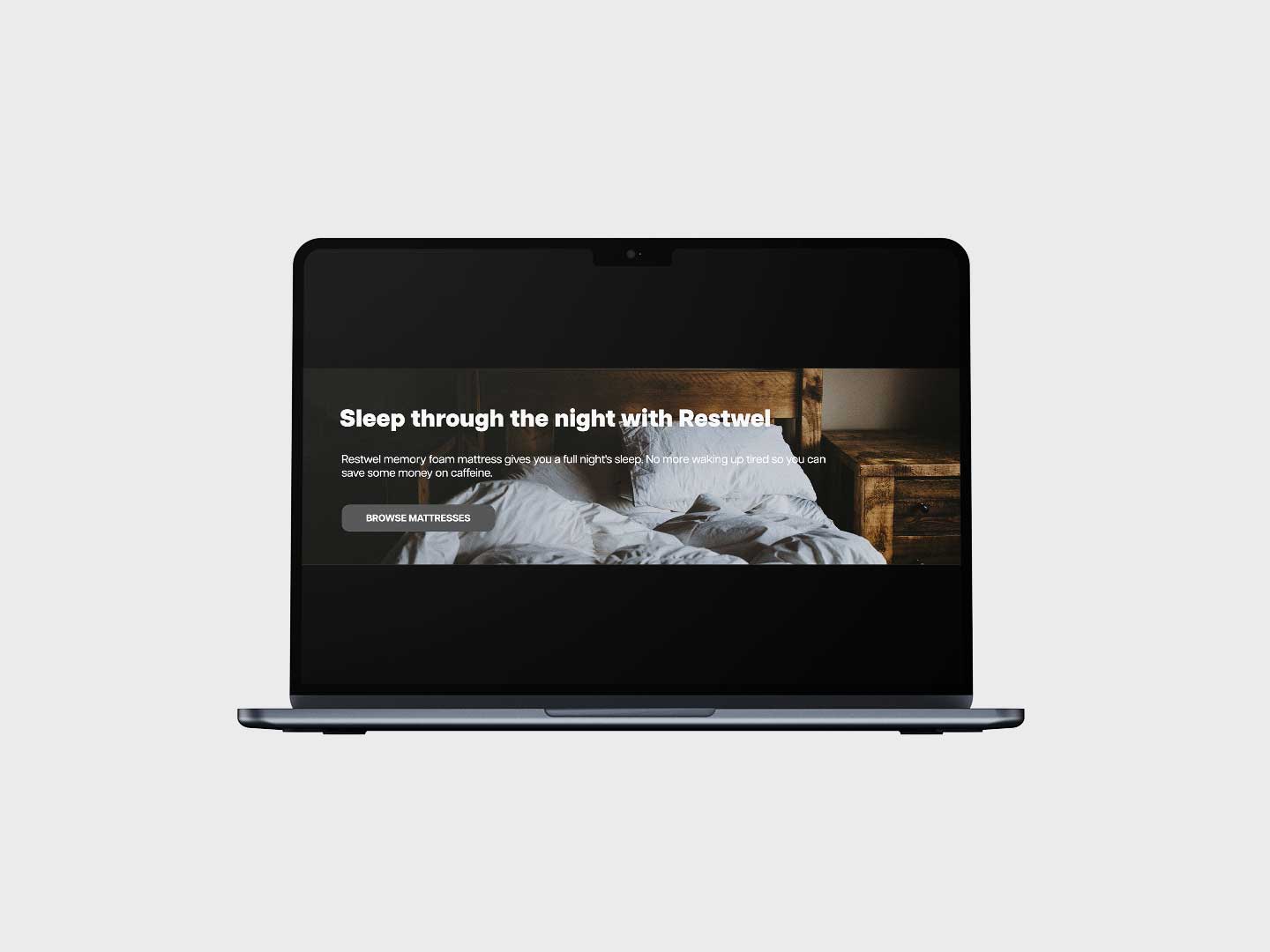
The purpose of this assignment was to create a responsive banner with a call to action for a fictional company. The goal of this assignment was to demonstrate our understanding of CSS @media.
Project Result: Live Preview Here
Details
- Role — Web Developer
- Software — VS Code
- Total Time — 3 hours 15 minutes
Brainstorming
Beginning of brainstorming for the banner content; the company name, colour scheme, and background image was chosen along with the completion of copy. The company, Restwel, is a memory foam mattress company whose target audience are millennials; thus, the copy is a bit cheeky: “Restwel memory foam mattress gives you a full night's sleep. No more waking up tired so you can save some money on caffeine”.
The colour scheme chosen was monochromatic with various shades of grey. As it’s a mid-end mattress company, monochromatic colour scheme would give the company a classier and more elegant feeling. The various shades of grey would also give feelings of simplicity and purity, as to not overwhelm an average customer.
The thumbnail sketches included 3 different viewport widths, all of which had rough measurements of a phone, tablet, and computer monitor ratios. The banner layout was revised through different iterations, playing with elements being either inside or outside of the banner image depending on the viewport width.
Base HTML & CSS
The HTML was written with the CSS and a mobile-first approach in mind. Thinking about the content that would go into the banner, divs were used to separate content that would have its own CSS properties such as positioning, size, height, and alignment. A reset CSS was obtained from the internet so the final product would look consistent throughout different browsers, as different browsers have their own CSS preferences and look.
Responsiveness with @media
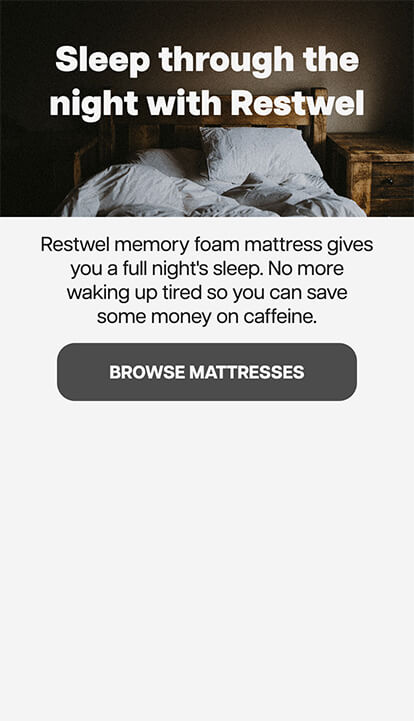
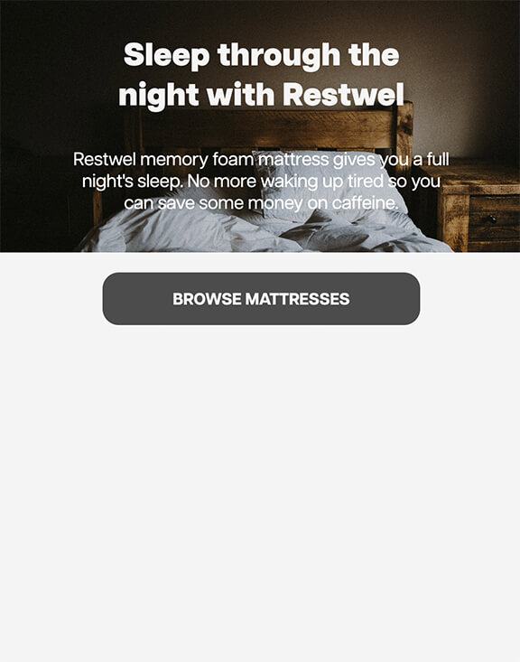
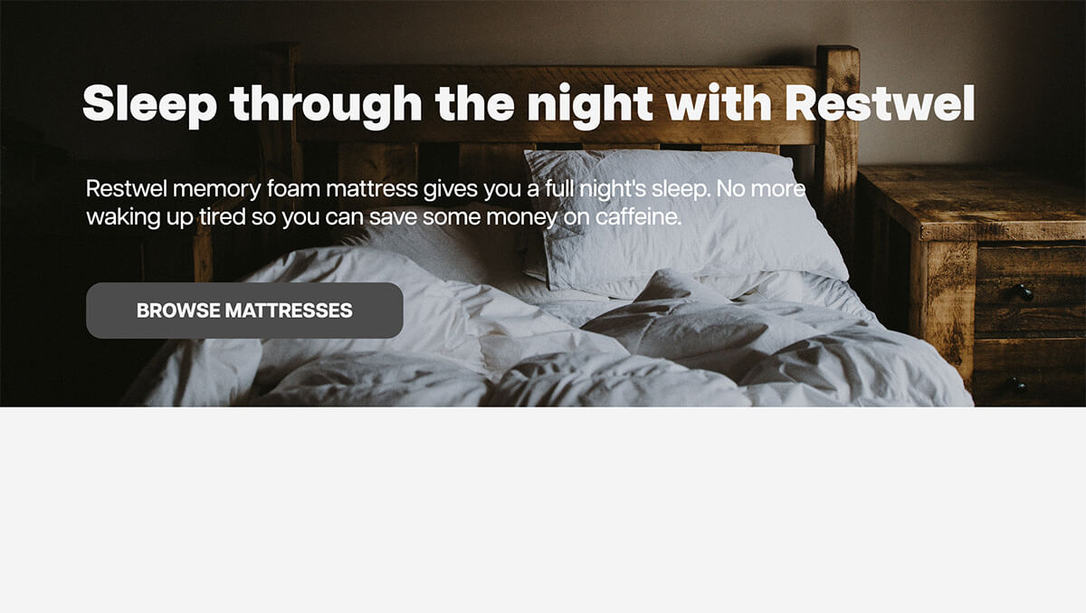
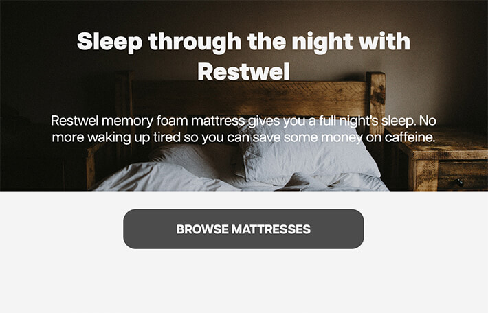
The @media was written for each breakpoint: 414px, 576px, 768px, 992px, 1200px. For viewport sizes that are less than 575px in width, the banner image would only contain the header with the copy and the button are underneath it. For viewport sizes 991px and below, everything is center-justified with the header and copy inside the banner image and the button still outside the banner. Viewport width 992px and above has the content left-justified with the header, copy and button inside the banner image, font-size is also increased. At viewport width 1200px, the font-size is increased and the banner image height is also increased.
Thanks for reading through the end! I really appreciate your interest in my projects. :)
Check out my other projects!
