Cha House Kombucha
Purpose
The goal of this project was to make a poster advertisment for a fictional beverage company using Adobe Illustrator. Illustrator tools used throughout this project includes: type tool, 3D revolve, 3D extrude, 3D mapping, perspective grid tool, and more.
Details
- Role — Graphic designer
- Software — Adobe Illustrator
- Total Time — 20 hours 35 minutes
Brainstorming
Cha House Kombucha sells kombucha brewed with Chinese tea flavours such as chrysanthemum, jasmine, oolong, pu’er, tieguanyin, and winter melon. The intended marketed place would be at Asian grocers like T&T and smaller local grocers such as City Avenue Market and Donald’s Market. Target demographis are Chinese diaspora who enjoys both Chinese tea and kombucha. People who drink kombucha tend to be more health concious with a bit of disposable income. Age range of the target audience ranges from 25 to 45.
Branding
Cha – 茶 – is ‘tea’ in Mandarin, so Cha House means ‘tea house’. In the company name, I wanted to convey the relaxing and casual feelings of tea houses in China.
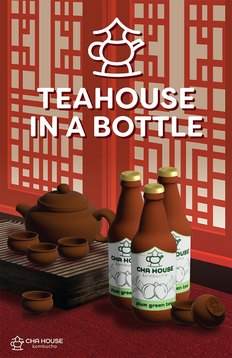
For the logo, I wanted to draw a shape that would be similar to the modern Chinese character for tea pot – 壺 – since, historically, written Chinese originates from picto- graphs. In the final version, I took inspiration from the ancient glyph (the reference on the right) for the Chinese character for ‘tea pot’. The tea pot in the logo refers to the ‘cha’, and the shape on top of the tea pot looks like a house.

The lines of the logo and typography are mostly curved to smoothly guide the eyes, and also give off casual feelings since everything is rounded. The colours I chose for the logo are different values of green to encourage psychological associations with nature and freshness, and green tea leaves.
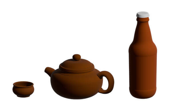
3D Modelling in Adobe Illustrator
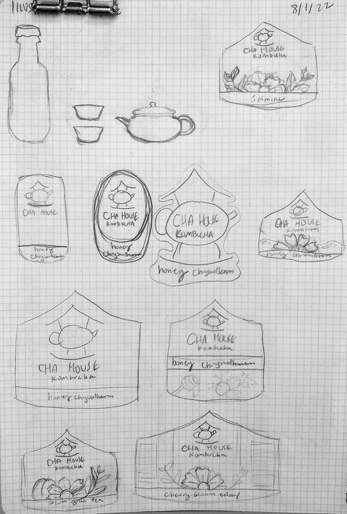
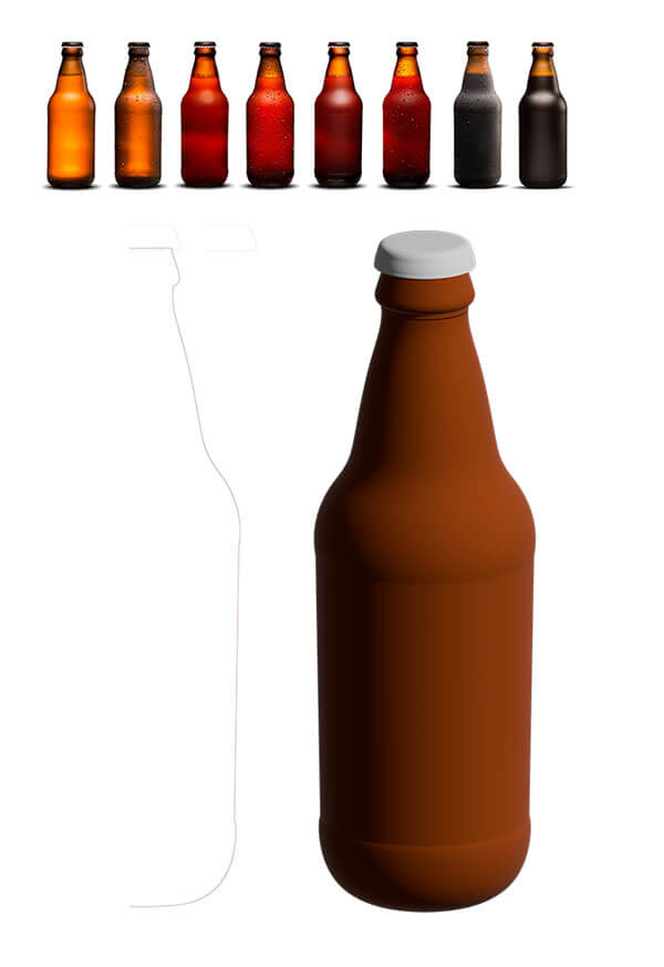
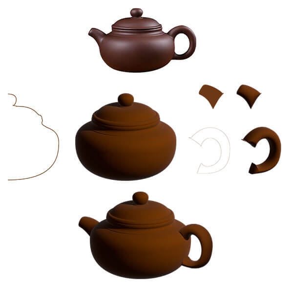
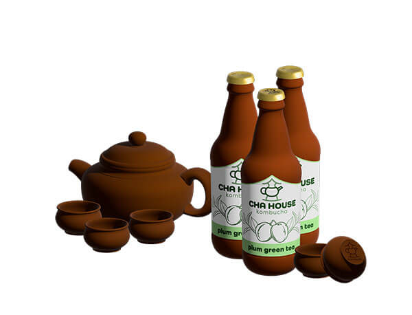
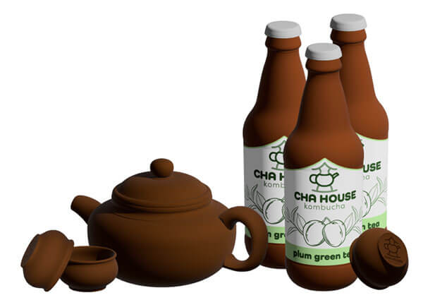
Using reference images from Adobe Stock and Google Images, the bottle, teacups and teapot was created using Illustrator’s 3D materials tools. The bottle lable was sketched, iterated, and digitalized in Illustrator to be able to map onto the created 3D bottle. Here, I played with several different staging for all the items.
Staging in Adobe Illustrator
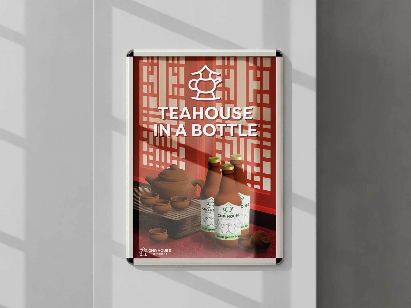
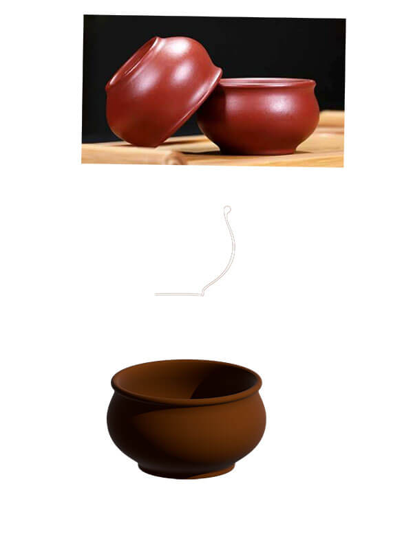
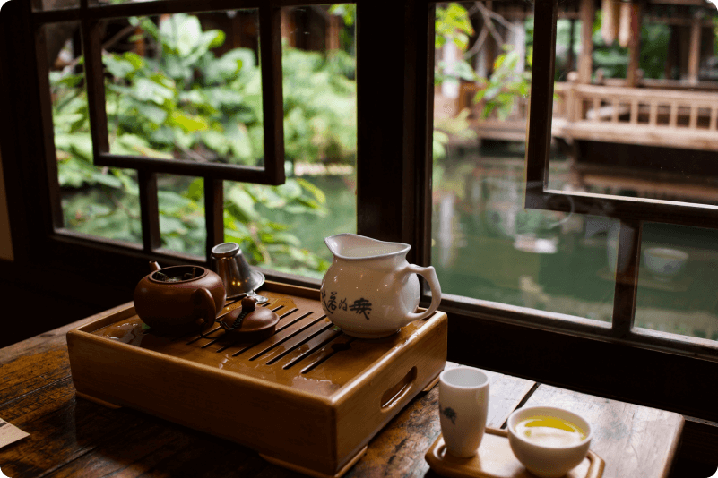
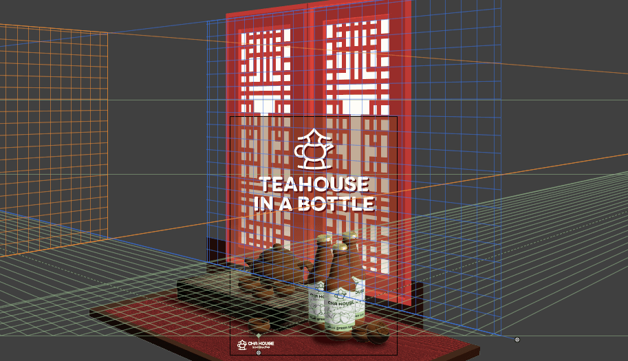
I wanted to frame the final product poster similar to this picture I found on Google Images. Through the use of the perspective grid tool in Illustrator, I was able to achieve it.
I also built a table and tea tray using Illustrator's extrude tool and mapped textures from Adobe Stock onto them.
A subtle gradient was added behind the slogan and logo since the background is quite visually busy. The gradient makes the slogan and logo stand out more. With that, the project was complete!
Thanks for reading through the end! I really appreciate your interest in my projects. :)
Check out my other projects!